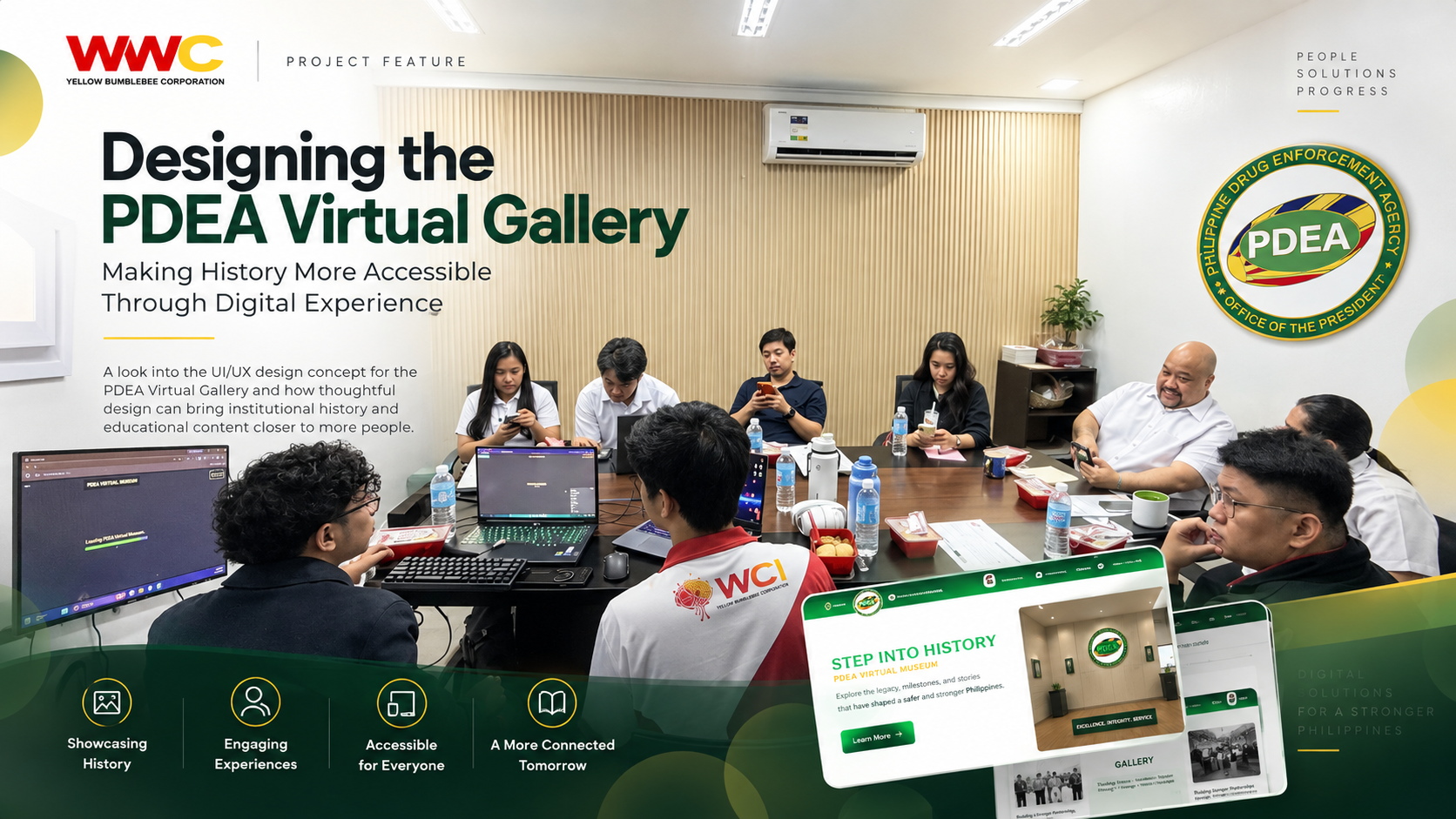
Designing the PDEA Virtual Gallery: Making History More Accessible Through Digital Experience
· 7 min read
By Marjorie F. Jetajobe
Museums, galleries, and institutional archives are no longer limited to physical spaces. Digital experiences can help organizations present their history, achievements, photographs, educational materials, and important milestones to a much wider audience. The PDEA Virtual Gallery web design concept explores how a traditional collection of historical and educational information can be transformed into a structured, accessible, and visually engaging online experience. Instead of simply displaying information on a series of web pages, the design focuses on helping visitors move through content naturally—discovering stories, understanding context, and exploring institutional history through a modern interface.
Designing More Than an Online Gallery
A virtual gallery may look simple from the outside: photographs, descriptions, timelines, documents, and navigation. But designing one effectively involves much more. A visitor needs to understand where they are, what they are looking at, and where they can go next without feeling overwhelmed by the amount of information available. For the PDEA Virtual Gallery concept, the interface was approached as an experience rather than simply a collection of pages. Typography, spacing, visual hierarchy, imagery, navigation, and responsive behavior all work together to guide visitors through the content. The objective is straightforward: make important information easier to discover, understand, and remember.
The Experience Needed to Solve Several Design Challenges
- Present historical and educational material without overwhelming visitors.Establish a clear visual hierarchy between titles, supporting information, images, and descriptions.
- Make navigation understandable even for first-time visitors.
- Maintain readability across desktop, tablet, and mobile screens.
- Create visual consistency across different sections of the gallery.
- Allow important photographs and historical materials to remain the focus of the experience.
- Balance institutional presentation with a modern and approachable interface.
- Design interactions that encourage visitors to continue exploring.
Building the Experience Around the Visitor
Good interface design begins by understanding what visitors need to accomplish. Someone entering a virtual museum may want to learn about an organization's history. Another visitor may be looking for a particular event, person, photograph, or milestone. Others may simply want to browse. Because these visitors have different goals, the experience should not force everyone into one rigid path. The design therefore emphasizes clear entry points, recognizable sections, meaningful headings, and content that can be scanned before someone decides to explore more deeply.
A Simple UX Process Guided the Concept
- Identify the content hierarchy: Determine which information should appear first and how related materials should be grouped.
- Organize the visitor journey: Establish how users move between the main gallery, individual exhibits, historical information, and supporting content.
- Develop the visual direction: Use typography, imagery, spacing, and color to create an interface appropriate for institutional and historical content.
- Design reusable interface patterns: Maintain consistency between exhibit cards, content sections, buttons, headings, and navigation elements.
- Adapt the layout for multiple devices: Ensure important information remains readable and usable regardless of screen size.
- Refine interactions and visual hierarchy: Remove unnecessary elements and allow the content itself to remain the central focus.
“A successful digital gallery should not make visitors think about the interface. It should make it easier for them to focus on the stories, information, and history being presented.”
Using Visual Hierarchy to Guide Attention
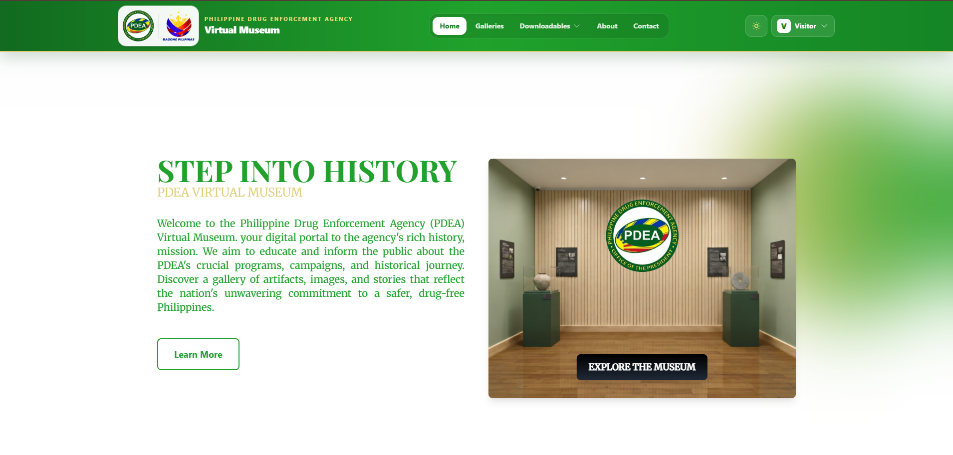
One of the most important parts of the design is deciding what visitors should notice first. Large headings introduce major topics, supporting text provides context, and imagery gives visitors a visual point of reference. Secondary information is intentionally quieter so it does not compete with the primary content. This hierarchy becomes especially important when an interface contains historical photographs, long descriptions, dates, categories, and other supporting information. Rather than giving every element the same visual weight, the interface creates levels of importance. The result is a page that visitors can scan quickly while still having enough detail available when they want to explore further.
Typography Becomes Part of the Navigation
Typography does more than make words readable. Heading size, font weight, spacing, line length, and contrast help visitors understand relationships between different pieces of information. A strong page title immediately establishes the subject. Section headings break longer content into manageable groups. Short descriptions help visitors decide whether they want to continue reading. When these elements follow a consistent system, users begin to understand the interface without needing additional instructions.
Designing Around the Content, Not Around Decoration
Historical and educational interfaces often contain valuable photographs and reference materials. Those assets should remain the focus. For that reason, the PDEA Virtual Gallery concept avoids filling every area with decorative UI elements. Instead, whitespace provides separation between sections, subtle visual treatments support important information, and images are given enough room to communicate their meaning. This approach creates a cleaner experience while helping preserve the seriousness and context of institutional content.
Some of the Core Design Principles Included
- Clear page hierarchyConsistent spacing
- Readable content widths
- Strong image presentation
- Predictable navigation
- Responsive layouts
- Accessible typography
- Understandable calls to action
- Reduced visual clutter
- Consistent component styling
Responsive Design Matters for Digital Museums
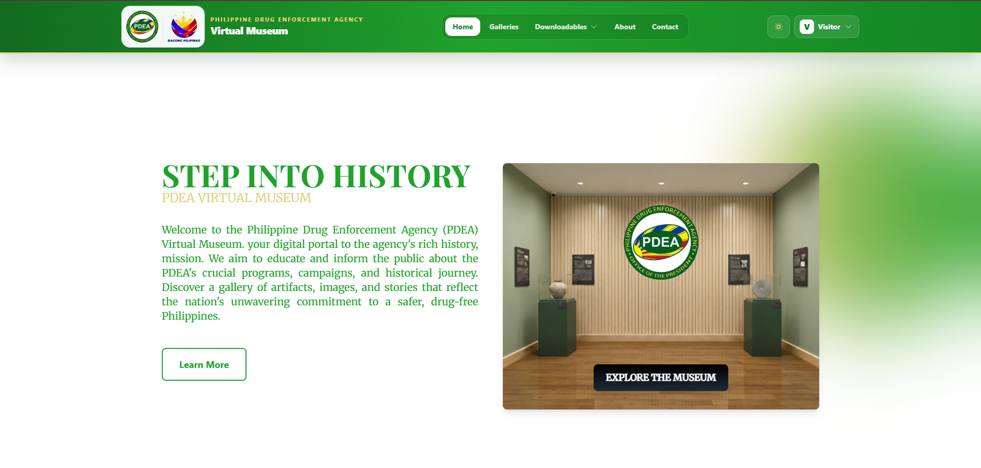
A virtual gallery may be opened from a desktop computer in an office, a tablet in a classroom, or a mobile phone while someone is traveling.That means responsive design cannot be treated as an afterthought. Content needs to reorganize intelligently as available space changes. Multiple columns may become a single column. Images should resize without losing their importance. Navigation needs to remain usable without occupying most of the screen. The goal is not simply to make the desktop interface smaller. The goal is to preserve the same content hierarchy and usability across different devices.
Accessibility Supports a Wider Audience
Digital historical resources are most useful when more people can access them. Readable text, sufficient contrast, descriptive image text, predictable navigation, properly structured headings, and understandable interactions all contribute to a more inclusive experience. Accessibility also improves general usability. Clearer navigation helps everyone. Descriptive headings make long articles easier to scan. Alternative text helps screen-reader users while also providing useful context when an image cannot be displayed. For an educational or institutional website, these considerations should be part of the design process from the beginning.
Turning Institutional History Into Digital Storytelling
One of the opportunities offered by a virtual gallery is the ability to tell stories differently from a physical exhibition. Instead of being restricted by walls or physical display cases, digital content can connect related materials through categories, timelines, images, contextual explanations, and interactive navigation. A photograph can lead to a historical period. A milestone can connect to supporting materials. Related exhibits can help visitors continue exploring without returning to the starting point every time. This creates a more connected experience and allows visitors to explore information at their own pace.
What We Learned From the Concept
The PDEA Virtual Gallery concept reinforced a principle that applies to many digital projects: “Technology creates the platform, but thoughtful design determines whether people can actually understand and explore what that platform contains.” The interface becomes stronger when designers first understand what information needs to be communicated, how visitors are likely to explore it, and which elements deserve the most attention. Visual design can then support those decisions rather than compete with them. This is particularly important for government, institutional, educational, and historical websites where clarity and accessibility are just as important as visual presentation.
“Technology creates the platform, but thoughtful design determines whether people can actually understand and explore what that platform contains.”
A Digital Space for Learning and Discovery
The PDEA Virtual Gallery demonstrates how UX/UI design can help transform historical and educational material into a more approachable digital experience. Through structured information architecture, thoughtful visual hierarchy, responsive layouts, and accessible interaction patterns, an online gallery can become more than a repository of information. It can become a space for discovery. For WWC, projects like this also demonstrate how interface design can support organizations whose content needs to remain informative, credible, organized, and accessible while still delivering a contemporary digital experience.